
Tuesday, 23 October 2012
Research and planning: Audience video interview questions

Tuesday, 16 October 2012
Research and Planning: Double page spread analysis

Target Audience: By the layout, language and the images used we can tell that this magazine is aimed at younger people who are interested in rock music, there are no key clues to tell as to which gender, but its a pretty good guess that it is for both.
Layout: The main pictures used are of the band, this is good as it would attract the audience straight to the page.
Friday, 12 October 2012
Research and Planning: Contents Analysis

Genre: The genre for this contents page is rock, this is shown by the images used and the features shown in the magazine. Also the colours used also connote a rock/indie theme.
Target Audience: I think that the target audience for this magazine is probably teenagers - young adults of either genre, who are interested in this type of music. I think this because of the bands used and also the language.
Layout: The layout of the page is quite organised as the content is set into different sections depending on what it is. The middle is largely taken up by a picture of Kasabian, which is depicted underneath.
Media Language: A master shot of Kasabian is used as the main central image in a low light, the fact that an image of them at a concert was used rather than a studio shot suggests that it was a big story and needed to emphasise the point. The colours used are very bold and connote the 'Indie'/rock style.
Representation: The image used isn't a studio shot so its hard to depict why the mise en scen is how it is. However we can tell by the fact that the image was used that it holds some value to the story.
Wednesday, 10 October 2012
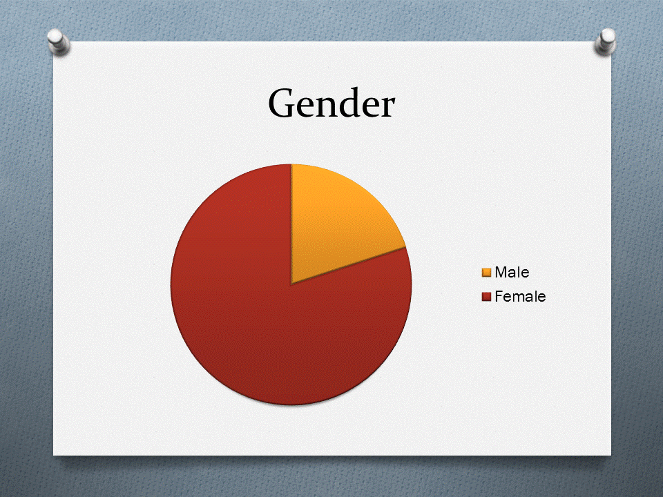
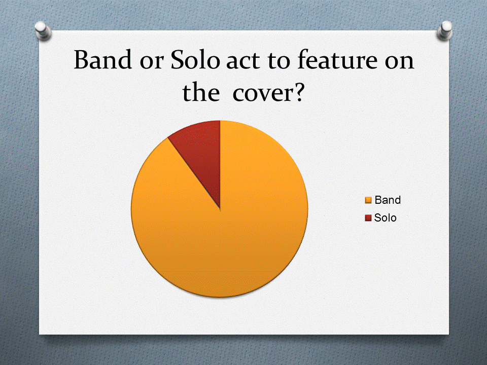
Research and planning: Questionnaire results
Through this method I have been given a clearer insight into how my magazine should be designed and developed. For instance I now know what colours would be better used in my magazine and what price range I should be looking at. I also have a clearer idea of how I should lay things out by knowing to have a band rather than a solo artist on the cover, this can help me plan all of my pictures quicker.


Research and planning: Questionnaire

Here is my questionnaire to help me construct my music magazine
Tuesday, 9 October 2012
Research and planning: Draft of music magazine

Research and planning: Masthead designs


Research and planning: Collage

Research and planning: Music magazine cover analysis's x 2


Research and planning: Shot type research

- Close up
- Establishing shot
- Two shot
- Master shot


Research and Planning: Evaluation of college magazine
Front Cover:
I think that my front cover looks quite good. I think that I chose the font sizes correctly for their uses and they look correct on the page. My front cover consists only of blue, green and black so it follows the 3 colour rule, I chose these colours because they look bright and vibrant, but can also be used to look serious too. I have used a similar look on my contents page and would continue the look throughout the magazine if needed. The main central image used is a high-light mid-shot of my friend, who is using direct address to connect with the audience and is smiling to give off a friendly look that I wanted my magazine to represent about the college. I think that I chose the right amount of stories on the cover and I think that the stories that I did choose work well and would grab my audiences attention.
Contents Page:
I think that the font sizes on the contents page are good because it allows me to show everything that is included in the story, whilst still making it clear. Like the front cover the contents page follows the same 3 colour rule that I would be using consistently throughout the magazine. It is mainly because of this that I feel you can tell that the contents page and the front cover are from the same magazine, another feature that helps with this point is the tone I tried to express through the magazine. The photographs that I have used were chosen because I feel that the represent the college well, each photograph is well taken and appropriate for the magazine. I feel like I included enough stories in my contents page as I didnt want it to be too long, but I included a fair few stories anyway.


Subscribe to:
Posts (Atom)